Showing posts with label Colour. Show all posts

Sunday, 8 September 2013

Beauty: Bibi by Michael Taborsky in 'Dazed Fairy'


With the magazine publishing industry growing bigger than ever and the format of magazine continuously shifting, it's never been so easy to create a magazine online. One that stood out was institutemag.com. I particularly like the beauty editorials such as 'Dazed Fairy' by Michael Taborsky, a talented photographer who has only been shooting fashion and beauty since 2012. I particularly like the softness and shallow depth of field, this effect to portraits really draws you in. Her skin is like silk complimenting the colourful hair, beauty and accessories styling. This is a good example of talented individuals making a striking editorial. She certainly is a captivating dazed fairy.


Dazed Fairy4
Dazed Fairy5
Dazed Fairy6


Wednesday, 16 May 2012

Exhibition Review: London - Paolo Roversi and Guy Bourdin (25/02/12)

On 25 Feb 2012 I visited London and dragged my boyfriend to two galleries that were showcasing fashion portraiture; Paolo Roversi at the Wapping Project Bankside in Southwark and Guy Bourdin at the Michael Hoppen Gallery near South Kensington. Though both photographers sharing the interest of fashion their approaches are very dissimilar and was interesting to see two different exhibitions in one day.


Guinevere Van Seenus by Paolo Reversi
Image Source: http://www.1883magazineblog.com/paolo-roversi-at-the-wapping-project-bankside/


Paolo Roversi is renowned for his soft focus, shallow depth of field, ‘rustic’ portraits that have been described as timeless. The models in his images do not look like stereotypical models and are dressed down. I like how he shows their natural beauty and captures ‘rawness’ unlike any photographer I’ve seen. In the above image she is partially nude yet the viewer does not first think this but we are drawn to her alluring expression. This photograph is difficult to date when it was taken as the characteristics do not show anything of this time, hence the ‘timelessness’ to his photographs. Her expression is ethereal yet focused directly at the viewer creating an almost haunting look reminiscing that of the Pictorial era in the late 19th and early 20th century. My two favourite photographs in this exhibition was a black-and-white portrait of Natalia Vodianova and an exquisite large colour print of Guinevere Van Seenus. My boyfriend, (he’s no art expert!) managed to feel these were the most expensive prints on sale, and rightly so: I think these were Reversi’s strongest exhibiting pieces (see below).


Guinevere Van Seenus by Paolo Reversi
Image Source: http://www.nowness.com/day/2012/1/29/1850/paolo-roversi-my-guinevere

I enjoyed this exhibition as it was displayed in a clean and clear manner; the prints weren’t too big or small and were spread out evenly through a vast white space. The visitor didn’t feel enclosed or too open. Even my boyfriend who isn’t interested in art much, let alone fashion photography was quite impressed with the work. 

Later in the day I rushed to the Michael Hoppen Gallery just in time before it closed. The exhibition wasn’t what I expected it to be: it was much smaller and cramped and the prints were hung in distracting places such against a bookshelf full of colourful books. Bourdin is renowned as a master of colour so was a shame to drown out his prints with even more colour and clutter in the exhibition. I hadn’t really researched much of Bourdin’s work before visiting except the knowledge of his erotic photographs. After going to the exhibition I wasn’t too keen on his work as it was too much ‘in your face’ and didn’t allow the viewer to digest the photograph as there was a lot going on. This was a surprise to me as I had read many comparisons between Helmut Newton and Bourdin and I am completely enticed by Newton’s work even naming him as one of my favourite photographers. However Bourdin did stimulate discussion and one must applaud his technical ability using vivid colour which was new at that time. One that I found particularly interesting was ‘Campaign for Charles Jourdan, Spring 1979’ (below) due to the clashing of bold yellow and red and the unusual posture of the female model. Bourdin is commendable on taking fashion photography to new depths and wasn’t afraid of pushing the boundaries of a fashion image thus challenging the expected stood-straight face-on pose to the camera. Though I am not prudent and fully embrace female sexuality represented in fashion photography I did find some of his work quite crude however there were a few pieces that were composed wonderfully with flair.


Campaign for Charles Jourdan, Spring 1979 by Guy Bourdin
Image source: http://lamblegs.wordpress.com/2010/02/13/hot-photo-friday-guy-bourdin/

Though the two photographers are regarding amongst the elite in the fashion world, they have very differing styles and approaches. Overall I preferred the Paolo Reversi exhibition at the Wapping Project Bankside than I did for Guy Bourdin at the Michael Hoppen Gallery. One of the reasons for this was the layout and space at the Reversi exhibition; I was able to absorb his images, feel the model’s expressions and the photographer’s mood. Whilst visiting these exhibitions I was engrossed in my ‘Beauty’ project so couldn’t help but notice the subject matter; both photographers featured nude models and all were Caucasian. Where are the ethnic models? I enjoyed how this day questioned how beauty can be presented in contrasting ways and the power a renowned photographer can have on influencing the new generation on what a beautiful image and model is.

Exhibition photographs I took at the gallery:

Paolo Reversi @ The Wapping Project Bankside


Guy Bourdin @ The Michael Hoppen Gallery


Bibliography:

Useful Links:
Paolo Reversi interview PDF article (British Journal of Photography) - http://www.thewappingprojectbankside.com/artists/paolo_roversi/press/BJP-March-2012-Roversi.pdf
Michael Hoppen Gallery - http://www.michaelhoppengallery.com/

Tuesday, 15 May 2012

Image Exposure: Charlotte Free by Terry Richardson

For one of my other modules on my photography course I was looking into fashion photography and style and thought of Terry's work. One of the images that caught my eye whilst looking through his wealth of images on Terry's Diary was one of model Charlotte Free.

Charlotte Free at my studio #9
December 29th, 2011


This particular photograph stands out from his vast archive of images where he posts practically every day. It dates back to December 29th, 2011 with a caption of ‘Charlotte Free at my studio #9’. I like how simple the set-up is with a single flash attached to the camera body as the only source of light. This set-up is most common for his studio portraiture where he shoots many of his friends, acquaintances and models in his home studio. Usually he shoots black/white for this set up however there are examples of colour portraits such as the above photo. Terry prefers taking pictures in a landscape format showing only the torso and face. I think this particular set-up of shooting is Terry’s trademark style and is reminiscent of his portrait editorials for big magazines such as Rolling Stone. There have even been editorials using this simple set up for magazines like Purple Fashion. Despite Charlotte Free being an up-and-coming model being shot for various advertisements I originally thought she was one of Terry’s acquaintances who had quirky style so decided to shoot her over again. The reason why I chose this shot is I like the off white background and the slight vignette from where the flash fades outwards and her carefree expression. Terry has a great knack of getting the most of his subjects and showing off their personality on camera. He isn’t afraid of highlighting the fun side of ‘untouchable’ celebrities and portraying them as normal people who want to have fun too. In relation to my project about photographing people with style and loving what they wear, Charlotte Free is a great example of individual style. This photo isn’t made up and she hasn’t got a make-up/stylist team on hand; she is herself wearing clothes she enjoys wearing. The salmon pink colour in her t-shirt goes with the aesthetics of her hair and pale skin. Though this image only reveals one item of clothing, a person’s style is in much more than the clothes they wear, but how they wear it as well as the characteristics of their hair and skin. The viewer feels the essence of being a kid and having childlike freedom from her ‘The Ren & Stimpy’ t-shirt (which is seen as vintage today) and the motion of flying her hair around.

Useful Links: 

Blog Exposure: Terry's Diary

My new feature 'Blog Exposure' will look at my favourite blogs all over the net alongside my other 'Exposure' posts such as 'Artist Exposure' and other snazzy new features coming soon! In a society slowly obsessed with blogging, a free platform to share our thoughts and snippets of our lives, there's been a sudden emergence in photographic blogs, fashion and all things 'artsy'.

This post will look at one of my favourite photographers: Terry Richardson, a fashion portrait photographer whose style is very bold, suggestive and fearless in his approach. He has photographed from the likes of Lada Gaga, Jared Leto, Katy Perry, Amy Winehouse, Kate Moss and even Barack Obama... (just to name a few!) I love his candid portrait photography especially those of celebrities as he shoots them in such a fun manner you wish you were there joining in with the laughter.

Print screen of Terry's diary home page 15/05/12 00:47 (GMT)  http://www.terrysdiary.com/

On his infamous Tumblr blog: http://www.terrysdiary.com/ which he updates daily the reader gets to see his life in photographs. Its an insight into pop culture's icons, the people we are obsessed with and Terry's diary is a window into that crazy world. He gets access no other photographer has gotten. I love the simple clean layout allowing the photographs speak for themselves and the consistently multiple daily posts. There's currently 599 pages on his blog with 15 images on each page; doing the math that's like 8985 images! Being a portrait lover inspired by pop culture this is the go-to blog.


Print screen of Terry's diary archive page 15/05/12 00:49 (GMT) http://www.terrysdiary.com/archive


Let me know what you think of Terry's Diary and your favourite images from his blog!


Useful Links: 
models.com - Terry Richardson http://models.com/people/terry-richardson

Read More:
V.E.S.T: Image Analysis: Charlotte Free by Terry Richardson http://nishahaqvisualexploration.blogspot.co.uk/2012/05/image-analysis-charlotte-free-by-terry.html

Thursday, 10 May 2012

Artist Exposure: Photographer Benoit Paillé

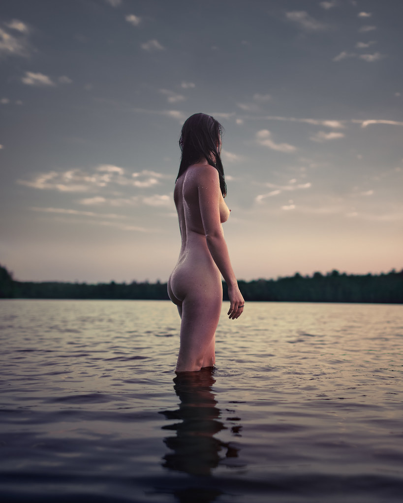
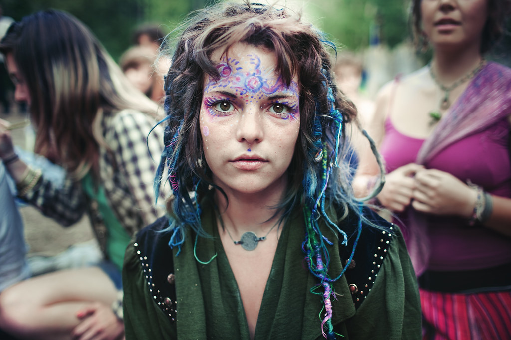
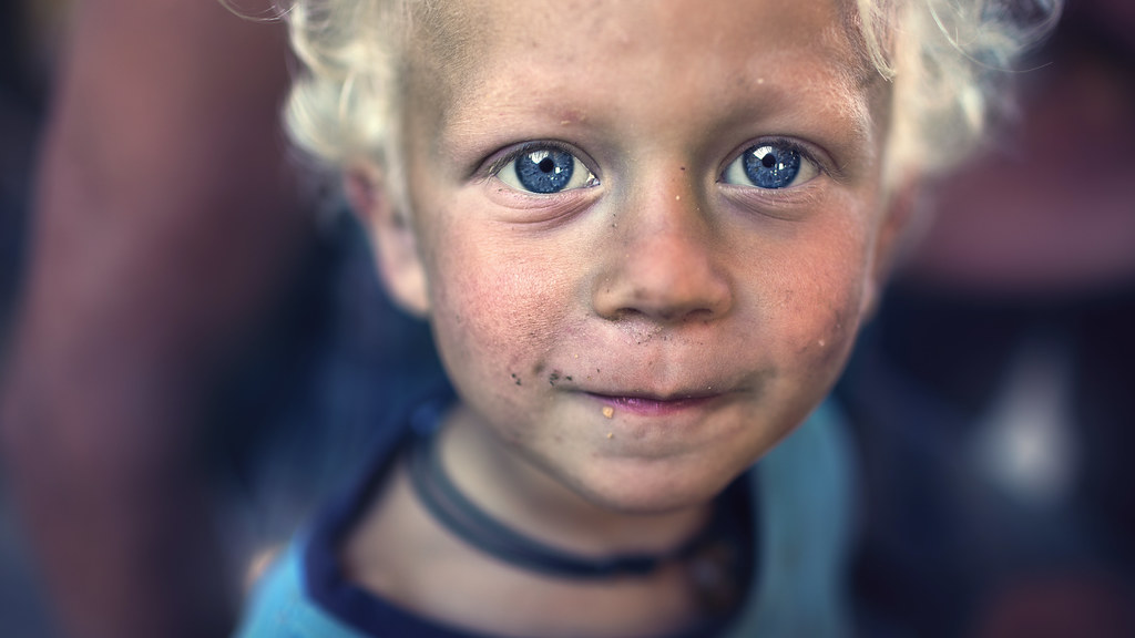
So I've decided to create a feature: 'Artist Exposure' which basically 'does what it says on the tin' sharing great work by great artists. This post will highlight amazing photographer, Benoit PaillĂ©'s who's work I've been following for a year now on Flickr http://www.flickr.com/photos/benoitpaille/ and his work just grows from strength to strength. In particular I love his sincere portraits and creative conceptual art series. He's created strong projects such as Night, Alternative Landscapes, Light Experimentation, Stranger, Self-Portrait Stranger, Art Installation Japan and one of my favourites; Rainbow Gathering (below).

Rainbow Gathering is a series of portraits of his family. He states [1]
'I decided to photograph my family, my brothers and sisters. I have been going to rainbow gatherings for 7 years now, and I have taken pictures of it for the past 3 years. The pictures you see are very precious since photography is not usually allowed during the event, so please be respectful to my brothers and sisters

People are love,
are magic,
are beauty
these sister and brother are the people of the future.'
Being a portrait photographer myself I am instantly drawn to captivating expressions and characters and Paille captures this in the faces of Rainbow Gatherers. It is interesting as a viewer to get an insight to an event that doesn't usually allow photographs taken so the project itself is a rarity making it completely unique. We are transported into a world of 'peace, love, harmony, freedom and community'.[1] It is understandable to see why photography isn't allowed, as it can be seen as a medium of 'consumerism, capitalism and mass media' [1] however as Paille is a part of the family he isn't exploiting them, he is showing us and educating us that there are alternative lifestyles and great diversity in the world. In this series he travels to various locations for Rainbow Gatherings from Spain to Mexico and Canada which I think is amazing this project spans across the globe.

This is my favourite from the series:

Rainbow Gathering Québec,Canada 2010


(C) Benoit.P

(Above photo) I am instantly drawn to the beauty of her female form and how she seems so at peace with nature. The colours are beautiful and how he creates a serene landscape is remarkable balancing both portraiture and landscape in one composition. I like how natural she looks and how this doesn't seem posed. The fact this mysterious woman isn't looking at the camera hides her identity yet reveals everything but. This is what makes the photograph intensely intriguing. The details also make the image come alive, from the minute water droplets on her back, to the pink of her erect nipple and the reflection in the ripples adds to the beauty and serenity. This photo represents: 'peace, love, harmony, freedom.' [1]


Other favourites of mine in the series


All work (C) Benoit.P
All images from Benoit.P Flickr

References

Useful Links
Benoit Paille Behance http://www.behance.net/Benoitp

Related Posts Plugin for WordPress, Blogger...